Copyright Roger Cox
Southern National
1964
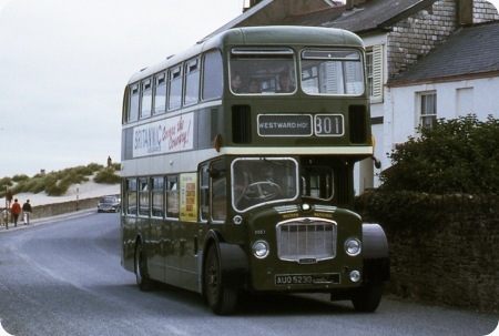
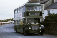
Bristol Lodekka FLF6B
ECW H38/32F
Stephen Ford asked, "Was Westward Ho! (Southern National) the only one that included an exclamation mark?"
I don’t know the answer to that, but here is a picture of a Bristol Lodekka displaying that very destination.

The bus is an FLF6B with ECW H38/32F body delivered to Southern National as their number 2053 in December 1964. It is seen here in the summer of 1970 carrying the Western National identity following the NBC decision to phase out the Southern National company name.
Photograph and Copy contributed by Roger Cox
A full list of Bristol codes can be seen here.
11/12/11 – 11:14
Would a D registration make it 1966? … and when did the NBC come into being….?
Joe
Thanks for that Joe pressed the wrong key there I think
11/12/11 – 20:05
Joe, the National Bus Company was formed in November 1968, but did not actually come into being until 1st January 1969, when the assets of the state-owned Transport Holding Company (THC) were transferred to it. On 1st March 1968, the British Electric Traction (BET) group’s British bus subsidiaries became wholly owned by the THC, thus becoming fully state-controlled at this point. It’s interesting to note that the THC’s forerunner, the British Transport Commission (BTC) also took over the railway shareholdings of BET’s bus operating subsidiaries in 1948, following nationalisation of the railways. Although BET remained in overall control and in the private sector, some of the BET shares held later by the BTC/THC were quite large. For example it held 50% ordinary share capital in Midland Red, City of Oxford , East Midlands, Hebble, Western Welsh and Yorkshire Woollen District, and nearly as much in East Yorkshire, North Western and Yorkshire Traction. All fascinating stuff as to who owns what, and doubtless no less complex today!
Regarding the age of the FLF Joe, if it had been a ‘D-Reg’ model, it would most likely have had only one cream band to its livery, as ECW omitted the upper deck one from 1966. What a handsome beast it is though, and that Westward Ho! destination surely demands to be shouted out loud!
Brendan Smith
12/12/11 – 06:40
And for the first two or three years, it was, to a large extent, pretty much ‘business as usual’ but then the corporate image brigade were brought in and, well you know the rest! However, enough of that, this post reminds me of a journey I once made on a similar vehicle of my local operator Midland General, but with a Gardner engine. I was bound for Nottingham but the FLF failed at Kimberley (a VERY unusual occurrence for MGO!) Because the frequency was good at this point, we only had to wait five minutes or so for the next bus to come along which was another FLF but with a Bristol engine. I could recognise the sound but I knew nothing about the performance or merits of the different engines and I always remember how much faster the Bristol engined one was. A driver told me later that the Bristol was a faster revving engine and although I’d always been a Gardner fan, I had to concede that the Bristol was the livelier performer!
Chris Barker
12/12/11 – 06:41
Prior to the Lodekka/FLF era, the services in the North Devon area were operated by fairly elderly K’s. Many of these had one-piece blinds combining the three digit route number and the "via" display. Towards the end of their lives, the route numbers were changed from the 100 to the 300 series. Rather than buying new (non-standard) blinds, SN simply pasted a permanent 3 inside the glass where it would obscure the 1.
Stephen Ford
13/12/11 – 08:52
The resort of Westward Ho! was named after the book of the same name by Charles Kingsley who also wrote the Water Babies
The action of the book took place in the same area of Devon and a group of speculators decided to cash in on the name
Chris Hough
13/12/11 – 08:53
After having some of the clearest and most informative destination displays in the early 1950’s, the BTC/THC companies generally fell from grace in later years and the above photo is a good example. The taped over aperture with minute lettering for ‘Westward Ho!’ is typical of where things ended up. It made the destination very difficult to read at any distance. Crosville was particularly bad with not only a very small ‘slot’ for the destination but they used a very light font as well. The ‘T’ shaped format which some of the group companies used seemed to give a clearer display.
Philip Halstead
13/12/11 – 08:54
Many of us thought it a shame that the various BET and THC liveries vanished in the early seventies. As Chris says, it appeared to be ‘business as usual’ for a while – new owners of businesses generally seem to leave things outwardly unchanged for about two years, before making what is now termed ‘a bold statement’. Some of the simplified liveries and fleet names applied to NBC coaches in the formative years were quite attractive – those adopted by Northern, Ribble and Greenslades spring to mind. When I heard that West Yorkshire Road Car had placed an order for Plaxton-bodied Bristol RELH coaches in the early 1970’s, I visualised them arriving in rich cream, with a deep waistband of maroon and large fleet names a la Ribble. Alas, this was not to be. They were delivered in the new corporate all over white livery with large NATIONAL red and blue lettering, and a very discreet (ie: tiny) West Yorkshire fleet name over each front wheel arch. To many of us this signalled that the era of quality and refinement had been replaced by the age of circus wagon-style ‘impact’. Relating to the FLF photo, Western and Southern National lost more than most with the whitewashing of it’s fine Royal Blue fleet.
Brendan Smith
13/12/11 – 11:19
But it wasn’t just the liveries that were third class, it was the quality of the paint itself. The rich, shiny finish of Tilling Green or Red would have been far superior to NBC Leaf Green and Poppy Red (which rapidly faded). [Typed Poopy Red. I think that was a Freudian slip!] The less said about National White the better!!!
David Oldfield
13/12/11 – 12:54
One of the worst companies for poor blind information was Eastern Counties who often showed a route number and the word service which did nothing to help the intending passenger Thec SBG companies were notorious for the extensive use of paper stickers a practice that still exists in the First Edinburgh fleet
Chris Hough
13/12/11 – 12:55
The green wasn’t too bad, but Poppy Red was a pathetic colour, even before it faded! Fortunately, in Gloucester, anyway, it only appeared on the few Cymru Genedlaethol/National Welsh buses from the Forest of Dean/Monmouthshire direction. And they couldn’t even get the Welsh right, either, since the above means National Wales! Being quirky, I quite liked having buses with Welsh on one side, but, my, it caused a stir among the local populace! Never, mind, the two colours didn’t last long and the ill-fated company not that much longer, into bankruptcy.
Chris Hebbron
17/12/11 – 07:41
I agree the NBC corporate colours were a terrible choice. The colours all looked ‘washed out’ and insipid when newly applied and none of them wore well, fading to a matt hue, particularly the poppy red. I thought the light grey wheels looked tacky and the grey/silver fleet numbers were virtually illegible.
The National white was passable on the modern coaches of the time such as the Plaxton Panorama or Duple Dominant but looked awful on the more shapely older designs. Not one of the best periods for the industry.
Philip Halstead
17/12/11 – 08:29
Thinking about those NBC colours, it is odd how such a dreadful set was chosen so was the choice down to one individual or group because I remember everybody hating them from the day they appeared? Surely the marketing men must have had some comments from the public which might have had some impact? Why did they stay in use so long?
Similarly, the current First Bus white, pink and purple is something that only looks passable on brand new vehicles but soon gets to look shabby and on the remaining old Dennis Darts, now rather battered and careworn, it looks dreadful.
Where and why have all of the interesting, vibrant and carefully chosen liveries gone…it cannot be cost just a lack of corporate interest or understanding that image is a very important part of building a successful Company.
Richard Leaman
17/12/11 – 16:24
Well I’ve heard it said that when you are a public company which is quoted on the London Stock Exchange, then the market expects a ‘corporate image’ to be applied, although the Go Ahead group seems to disprove this. Perhaps it’s simply a matter of cost reduction and expediency with good measures of misguidance and indifference also!
Regarding the NBC colours, I remember that when the first white coaches appeared, the ones which had glass panels at the rear incorporating the registration and fleet name had these altered to display N A T I O N A L in alternate red and blue letters. Apparently, this had to be quickly altered because it raised objections from the Police as only they are allowed to display illuminated blue signage on the rear of vehicles in darkness.
Chris Barker
17/12/11 – 16:25
When it was first set up, NBC tended to allow companies to follow their traditional paths. Then, in 1972, Freddie Wood was appointed Chairman, and from that point began the fixation with grandiose self importance as befitted "The Biggest Bus Company In The World". Thereafter, uniformity, standardisation and direction from the centre became the established order. Not only did the liveries descend to a nadir of mediocrity, but the standard font adopted for the group was unparalleled in its clumsy ugliness.
Now, with the dominant groups of today, we are back to much the same thing, with over tight constraints on budgets (particularly in the matter of maintenance) and minimal delegation of initiative to the local management. And as for some of the liveries……….
Roger Cox
18/12/11 – 07:59
…..and it’s all the swooping lines up, down and across the bodywork which look so out of place on what is essentially an oblong box with straight lines. Full marks to those few independents who have liveries which, although of varied hue, still have the dignity of style of the above vehicle and eschew purples and pinks!
Chris Hebbron
19/12/11 – 06:15
…..Epsom Coaches, the other Richmond, the Delaine – to name but three.
David Oldfield
27/01/12 – 06:25
I wholehearted agree with the adverse comments regarding the NBC liveries which replaced so many attractive colour schemes developed over many years which were instantly recognised by passengers and enthusiasts alike, it seemed to me to be corporate vandalism. I once asked a junior NBC manager why they chose to paint the coaches white he replied that it was a colour no one else was using at the time, when I asked had it not occurred to anyone that there was a good reason for that, maybe it was because other people realised that it showed dirt very badly and faded to a dull grey all to quickly, to which I didn’t get a proper answer.
Diesel Dave
25/02/12 – 07:18
Enjoying the various posts on the subject of NBC liveries. Perhaps the most ignominious change was in the North East, where the glorious rich ruby red of Northern General was repainted in awful pale, fading poppy pink! What was the name of the NGT red paint, anyone able to tell me? It really seemed redder to me when I was a kid!
Even worse, now – I’m surrounded by FirstBarbie!
Pwhisto
25/03/12 – 09:03
I heartily agree with the adverse comments about the poppy red and the peculiar green colour but my understanding is that they were a response to a Ministry circular of 10/71 which basically said that there were too many accidents at night caused by people running into buses painted in dark colours so buses should be painted in lighter colours. I recall that this was based on research in Scandinavia which showed that lighter coloured vehicles had less accidents and the Ministry also encouraged UK car owners to buy lighter coloured vehicles at much the same time.
Peter Cook
23/02/13 – 13:30
Whilst I agree with the posts that the NBC corporate colours could have been better it is noticeable that at bus rallies there is a growing number of vehicles appearing in NBC livery – including some that pre-date the formation of the NBC and could carry earlier company liveries. I cant help thinking that this shows that NBC corporate livery is actually liked by many – it was certainly better by far than the disgusting liveries of some of todays group, particularly First and Stagecoach. In answer to the writer who asked about the old Northern colour – this was officially know as BET Dark Red and was one of several colours specified by the BET Group for use within the BET companies – although of course many BET group companies used their own livery that did not incorporate a group standard colour. BET Dark Red was common to Northern General, East Midland, South Wales, City of Oxford and several smaller companies. It should be noted that although being a standard colour within BET the shade did vary slightly between companies due to different paint manufacturers.
In the early 1970’s I was involved in collecting many samples from all around the country and its very interesting to see just what a colour looked like even where a supposed ‘standard’ existed – I have in my possession several different shades of Tilling Green for example.
For a real mystery how about the so called ‘Ribble Red’ used for a few months by the new Alder Valley company prior to NBC Poppy Red – the colour is NOTHING like true Ribble Motor Services red !!. I’ve recently resprayed an EFE Bristol FLF in this colour which was matched from the original sample in my possession – it does look good.
DorsetBus
23/02/13 – 18:04
Can we see a photo of it, then, please, Dorsetbus?
Chris Hebbron
26/02/13 – 12:32
I wonder if the preservation of buses in non-authentic NBC liveries indicates the age of the preservationists concerned? I suspect that nostalgia grips us all in connection with a particular period of our lives. For me, the bus scene was from about age 3 (1952) to 15 (1964) and from there on it was downhill all the way! (Now I am a grumpy old man who can remember how much better it was then). But in 40-50 years those who are now in the 3-15 age range may well remember purple and pink Barbie Lockheads, or blue red and orange Souter Stagecoaches [or even, perish the thought, washed-out green and white Arriva Departures] with an equally warm and wistful glow.
Stephen Ford
26/02/13 – 13:32
Just as an aside to the colour scheme debate, does anyone agree that the Stagecoach hybrid double decker green scheme is probably the strongest and most appealing of the corporate identities around at the moment?
Phil Blinkhorn
26/02/13 – 13:33
As a grumpy old man born in 1952, I agree with you Stephen. My golden age is 1947 (Regent III/PD2) to 1969 (end of RegentV/PD3/FLF). There have been bright spots (both Leyland – the AN68 version of the Atlantean and the Olympian are worthy classics) in later times, but not many. As a coach man, the heavy Reliances, REs and later Leopards, as well as modern Tigers as well. The old liveries were aesthetically far better than modern and I prefer original to later. Even Sheffield had two alternative liveries and the Roes moved from to another with repaints under different General Managers. Authentic liveries to the vehicle are therefore correct – if not acceptable. [I think RTs and RMs in National Leaf Green are HORRIBLE!
David Oldfield
26/02/13 – 15:27
I know that there are still many on this forum who buy into the bad press of Stagecoach – most of which was press fabrication or exaggeration. [If you don’t believe me, consult OFFICIAL history, and I don’t mean just Stagecoach archives.] Their new corporate livery is fairly restrained but things like Gold and the "Green" liveries are lessons in restraint. Mind you, I think I would still put Go-Ahead ahead!
David Oldfield
26/02/13 – 17:25
I want to respond to two points in this thread. Firstly not everyone born in 1952 is grumpy, I’m actually quite nice [at times]. Secondly choice and memories of colour depends where you grew up. In Taunton it was green WN/SN buses and green/two tone greens of various WR diesel hydraulic locomotives plus green DMUs and a reminder "to eat your greens" which ultimately leads to that famous bus photographer’s quote – the other side is always greener.
Ken Jones
27/02/13 – 05:48
Well Ken. Somebody has to be nice, so it might as well be you. Congratulations. You have the job!
David Oldfield
27/02/13 – 05:49
Colour Schemes, Stephen: the other day I saw an Arriva repaint in cream, with the dark blue skirt but a turquoise (instead of cream) curl behind the door. Are we returning to normality?
Joe
04/04/13 – 06:19
Thank you to the person who asked about seeing a picture of my respray in Alder Valley Dark Red on an EFE FLF. Yes I’ll be only too happy to put a picture up once its finished – I’m now also doing a Bristol RE in the same livery having got the required info together so I’ll add a photo of this as well. Please give me a while though as I’m re-organising my workshop and with two upcoming model railway shows to attend with my layouts it may be later in the summer before I can finish the buses. Then its on to several other repaints such as a City of Gloucester (blue) VRT / Leyland National and RE in NBC style and then the first of the next steps – scratch built West Riding Guy Wulfrunians – more on that project later if anyone is interested.
DorsetBus
 Vehicle reminder shot for this posting
17/07/13 – 07:09
Just picked up on this thread with regards to NBC livery. When I first took an interest in buses in the 70s our school buses were Cumberland FLFs which were gradually being turned out in poppy red. At the time they seemed fresh and modern and the old livery seemed dark and past its sell by date. Not sure I would still agree though! Towards the end of the decade I went on a tour of the Leyland National factory. Apart from a pair of buses for McGill at Barrhead it seemed to be a sea of poppy red and leaf green. However, the shades of these so-called standard colours varied significantly from operator to operator. When I asked about this I was advised that each operator specified a different mix. The other NBC shade that I was very familiar with at that time was the yellow used by Northern on vehicles in the Tyne and Wear area. This was a shade of cadmium yellow as used by TWPTE (the British Standard was called Goldcup) and it worked much better than poppy red in an urban environment. What I don’t understand is why EFE keep churning out models in this livery but of a shade that is considerably paler and therefore very insipid. It is too light to even be excused as colour scaling!
Mike Morton
17/07/13 – 09:09
In response to Phil Blinkhorn’s ‘aside’ on this subject I agree the Stagecoach hybrid green livery is by far the best I have seen on a double decker for many years and is closely matched by the current Newport Buses livery on their single deck Scanias now operating the Park and Ride service in Cardiff (no doubt much to the ire of that City’s transport dept).
As a further aside, even the temptation of free Wi-Fi on Stagecoach hybrid operated route 50 in Manchester wasn’t sufficient to prevent me from route testing the new Metroline trams from East Didsbury to the Media City.
Orla Nutting
18/07/13 – 07:26
By coincidence, for the first time in around 10 years i was in the Newport and Cardiff areas 3 weeks ago and totally agree with Orla’s comments.
Phil Blinkhorn
